Lighter, Brighter, Faster Goalscape
Explore the latest enhancements to Goalscape's unique UI for improved performance, clarity and usability. Watch our video summary for more insights.
You can now toggle between dark and light mode through this little icon top right here. Just click on it and it switches to dark mode. Click on it again. It switches back to light mode. To create your own color theme, you can now open the theme panel and in the bottom you have my custom theme, and those colors can be adapted. You can do that either by selecting the color and entering the hex code color code. By picking it from the panel, the various different colors, you can adjust them and then pick the actual position, or you can use the color picker.
Click on that. And then for example, from a color theme from A PDF, you can just pick your color like this. That's probably the quickest way to adopt a color theme. In this case, it's the color theme of Instagram. You can just use the color picker and go through the individual colors and really quickly transfer your culprit color theme into Goalscape. And then you can even pin that color theme as your default color theme. And from there onwards, you can choose those colors either in the existing project or if you create a new project, you can pick the colors there.
We improve the goal labels in various ways. First of all, the automatic sizes were fine tuned. The display of the labels is smarter. The font looks more even, but now you can also mouse over the gold and that will display a gold label horizontally. Always, no matter if it's curtailed or not. In the past it was only shown on curtailed goals. Now it's shown on all the goals. So just mouse over it and you can read your goal name in a horizontal way. If you use the browser zoom, that would get bigger.
The goal labels would get bigger. So you can use the browser zoom to adjust the whole UI to your liking. This is back to a hundred percent, so just mouse over the goals only on the central goal. That's usually big enough and horizontal as is the label is not displayed, but on all other goals, the labels are displayed. And lastly, you can adjust in the settings that you want to show the full goal names, even if the resulting fonts are tiny. This has been a desired feature.
If you save that, now all goal names are displayed completely and as you mouses over it, you can read them even if they're tiny like that. Or you use the browser, zoom to zoom in, and then you can read them as well. Many users have asked us to hint at a way to display the presence of content. For example, if a comment is present to, to hint at that, or if an attachment is present. In this case, there is not. So the icons look gray out, but you can see there's notes present indicated by this blue icon.
And in this goal, for example, the blue icon indicates that there's comments present. So There's one here and there's attachments present. So you get an idea whether there is content or not, just a little helper. As you navigate Goalscape, we also increase the focus on importance adjustment. When you're adjusting importance, you're doing that relative to its siblings, and in order to focus on that better, we faded out all the other goals that you're not adjusting importance against.
So on this level two sub goal, if you increase it, you only see the siblings that you're adjusting importance against. On level one, it looks like this just increasing the focus on what you're doing. Likewise, as you're adjusting progress, you're seeing your sibling goals and the parent goal that is also adopting the progress from the sub goal. All the rest is faded out. Lastly, we've increased the load times even on goal skips that are huge. You can now reload and the loading time is lightning fast subsecond.
So I, we hope you enjoy these updates and let us know what you think.
The new Goalscape UI is lighter and brighter, and the latest performance enhancements make it run faster than ever. Read the details below or watch the video summary above.
Lighten up your Goals
Switch between Dark and Light mode using the toggle top right. 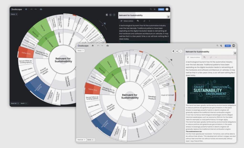
Custom Color Themes
Define your own color theme. Copy your corporate colors from a PDF or your website, then pin the color theme so it is used on all new Goalscape projects. 
Improved Goal Labels
To see goal names appear horizontally in the goal map just mouse over them.  For those who use long goal names there is a new option to display the name in full, even if that makes the text very small.

Content Presence Hints
See which goals have Notes, Comments or Attachments – without opening that tab. If content is present the icon is colored blue. 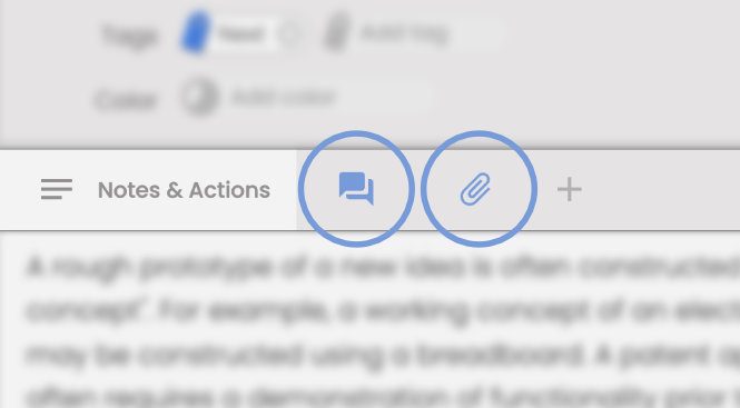
Importance and Progress Spotlight
For better focus when setting relative Importance and adjusting Progress. 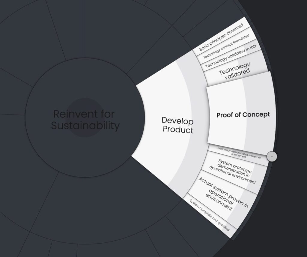 Please let us know what you think – you can use the Chat facility in Goalscape , on this website or click 'Email' in the footer below.